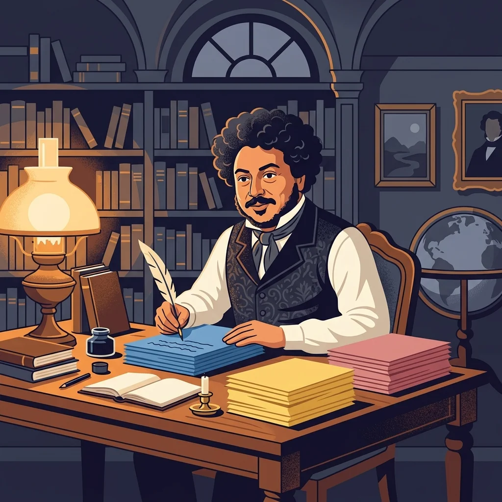
“The color of the paper is no mere whim. It is the key that guides my imagination directly into a specific genre.” ✍️
Alexandre Dumas (1802–1870) was the French literary titan whose swashbuckling masterpieces, including ‘The Three Musketeers’ and ‘The Count of Monte Cristo’, captured the imagination of readers worldwide. Producing hundreds of novels, plays, poems, and travelogues throughout his prolific career, how did he manage to switch rapidly between genres without suffering severe cognitive burnout?
To manage constant mental shifts between fiction, poetry, and journalism, Dumas established a strict visual system: he assigned dedicated paper colors to specific literary genres. He wrote all his fiction and novels strictly on light blue paper, crafted poetry on bright yellow sheets, and composed non-fiction articles and journalism exclusively on rose-pink paper. By visually separating his writing contexts, Dumas eliminated task-switching friction, allowing his visual cortex to immediately prime his prefrontal networks for the precise cognitive mode required for each discipline.
In today’s post, we analyze the brain science underlying Alexandre Dumas’s ‘color-switching’ routine—exploring color association and cognitive residue reduction—and present a 3-step practical action plan for modern professionals to minimize context-switching costs.
Historical & Academic Evidence
This content is based on Historical Verification from Alexandre Dumas's Autobiography *Mes Mémoires* & Cognitive Neuroscience Research.
 BuildSelf
Inspired by historical greats? Make it your daily habit!
BuildSelf
Inspired by historical greats? Make it your daily habit!

















1. Offsetting Task-Switching Costs via the ‘Color Priming Effect’
When switching rapidly between distinct cognitive tasks—such as strategic writing, quantitative financial analysis, or creative brainstorming—the brain incurs significant ‘Task-Switching Costs’. This lag occurs because ‘Cognitive Residue’ from the previous task occupies working memory in the prefrontal cortex, degrading execution efficiency. Alexandre Dumas’s color-coding method is a masterclass in ‘Visual Color Priming’. The instant the visual cortex detects a color strongly associated with a specific cognitive domain (e.g., blue paper for narrative fiction), it signals prefrontal networks to purge cognitive residue from the prior activity. This rapid neural contextual realignment minimizes switching friction and preserves working memory capacity.
2. 3-Step Practical Routine for Modern Professionals
Step 1: Categorizing Core Work into Max 3 Domains & Assigning Unique Colors
Divide your primary work responsibilities into 3 or fewer macro categories (e.g., analytical planning/coding, creative brainstorming/design, journal writing/review). Assign a distinct signature color (e.g., blue, yellow, pink) to each category.
Step 2: Physically or Digitally Isolating Work Tools by Color Theme
Configure your environment according to the assigned color keys: use matching physical notebook covers/paper, or set distinct background canvas themes, folder tag colors, and UI themes within digital apps (e.g., Notion, tablet note apps, IDEs).
Step 3: Visual Switching Routine to Purge Cognitive Residue at Task Onset
When transitioning to a new task, open the designated color-coded notebook or digital environment and gaze at the visual hue for 1 second. Allow your visual cortex to signal prefrontal networks to drop previous cognitive residue and engage total focus.
3. Caution & Tips: Establishing Clear Visual Boundaries & Simplifying Categories
For Dumas, colored paper was not a decorative gimmick, but an external neural prompt that defined rigid cognitive boundaries to erase switching friction. Avoid over-complicating this system with too many colors; assigning more than 3 active color themes prevents the brain from establishing strong associative learning and causes visual confusion. Keep your macro-task categories strictly to 3 or fewer, and maintain the assigned visual color themes consistently over time to build reliable neurological conditioning.
📌 Frequently Asked Questions (FAQ)
Does digital color-coding (Notion themes, tablet apps, browser themes) offer the same priming effect as analog paper? ▼
Yes, absolutely. The underlying mechanism depends on sensory conditioning between visual hue input and specific cognitive states, regardless of paper texture. Setting distinct canvas background themes in tablet apps, customized folder tag colors in Notion, or unique Chrome profile UI themes delivers identical neural priming signals to the prefrontal cortex.
Will assigning too many color variations trigger reverse cognitive overload or confusion? ▼
Yes, precisely. For the brain to organically bind a visual hue to a specific cognitive state, repeated and consistent associative learning is required. Using 5 or more complex color categories transforms visual cues into chaotic sensory clutter, destroying the priming effect. Limit your system strictly to 2 or 3 macro domains and keep assigned colors unchanged over time to maximize cognitive benefits.